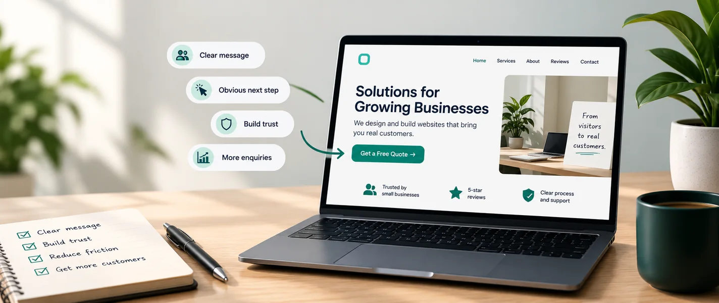
Plenty of small businesses have a website. Far fewer have one that brings in customers. The gap between "looks nice" and "actually works" rarely comes down to visual polish, it comes down to clarity, trust, and making the next step obvious. Here's what separates a website that converts from one that just exists.
Conversion isn't a trick, it's clarity
"Conversion" sounds like marketing jargon, but it just means: a visitor does the thing you hoped they'd do i.e. enquire, book, buy. You don't get there with clever tactics layered on a confusing site. You get there by making the site clear enough that the right person immediately understands what you offer and what to do next.
What actually moves the needle
1. Say what you do in seconds
Within a few seconds of landing, a visitor should know what you offer, who it's for, and why it's worth their attention. Clever taglines that hide the offer are the most common conversion killer. Clear beats clever, every time.
2. One obvious next step
Every page should have a clear primary action, "start a conversation," "book a call," "see pricing." If everything is emphasised, nothing is. Guide people to one next step rather than scattering ten links and hoping.
3. Build trust visibly
People buy from businesses they trust. Reviews, real examples of your work, a human "about" section, and a real way to reach you all quietly do the convincing. A site with no proof asks visitors to take a leap they usually won't.
4. Reduce friction
Every extra form field, confusing menu, or slow page is a reason to leave. Ask only for what you need. Make the contact path short. Speed counts too, a slow site loses people before they ever read a word.
5. Write for the customer, not yourself
Talk about their problem before your features. "We help small businesses look credible online" lands better than "we use a modern tech stack." Lead with the outcome they want.
Common mistakes that quietly lose customers
- A homepage that looks beautiful but never says what the business actually does.
- No clear call to action, or five competing ones.
- No proof: no reviews, no examples, no faces, no contact details.
- A contact form that asks for far too much, too soon.
- Slow loading, or a layout that falls apart on a phone.
How to tell if yours is working
You don't need fancy tools to start. Watch whether enquiries actually come through the site, and ask new customers how they found and chose you. If people visit but never get in touch, the problem is usually one of the five things above, most often unclear messaging or a hidden next step. (Worth a read alongside this: do you need a website or a web app?)
A website that converts respects the visitor's time: it tells them what they need, proves it's true, and makes the next step easy.
How we approach this at LyfWis
We design sites around the one or two actions that matter to your business, not around decoration. Clear message, honest proof, an obvious next step, and speed, that's most of the battle. If your current site gets visitors but not enquiries, tell us what's happening and we'll help you find the leak, or see how we approach websites.
Frequently asked
Why does my website get traffic but no leads?
Usually one of three things: visitors can't quickly tell what you do, there's no obvious next step, or there's nothing building enough trust to act. Fixing the message and the call to action is the common first win.
Do I need a redesign to convert better?
Often not. Many sites improve dramatically just by clarifying the message, adding proof, and making the primary action obvious, no full rebuild required.
How important is speed for conversion?
Very. People leave slow sites before they read anything, and search engines favour fast ones. Performance is part of conversion, not separate from it.